


Flexbox is a super-efficient layout module that was introduced in CSS3.
It aims at providing a more efficient way to layout, align and distribute space among items in a container, even when their size is unknown or dynamic.
Flexbox is a whole module and not a single property, it involves a lot of terminologies including its whole set of properties.
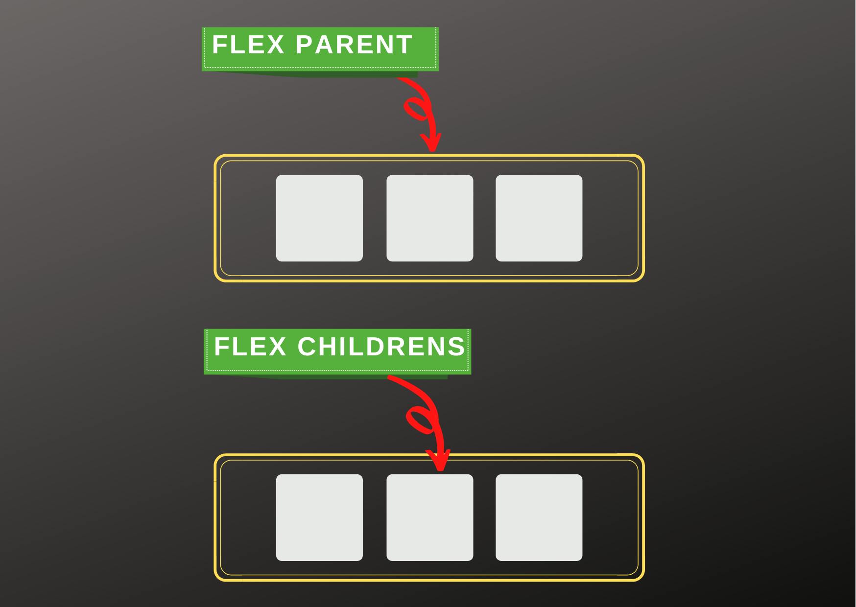
We call the parent container --> Flex Container
& the children -->Flex Items
There are 2 sets of Flexbox properties:
- Properties for Flex container ( Parent Container )
- Properties for Flex items ( Children )
But for this article, we would be discussing only Flex container ( Parent Container ) Properties. Let me know if you like this article and want the 2nd part of it.
Let's get started!
Flex Container Properties:
Display:
.container {
display: flex;
}
This defines the .container to be a Flex Container.
And It enables a flex context for all its direct children.
This property is needed if you are looking forward to using other flexbox properties.
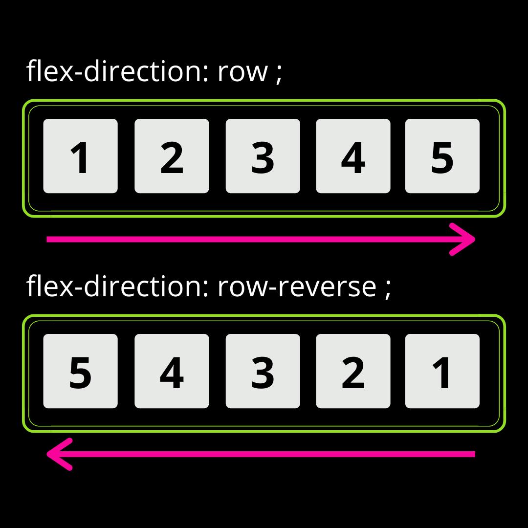
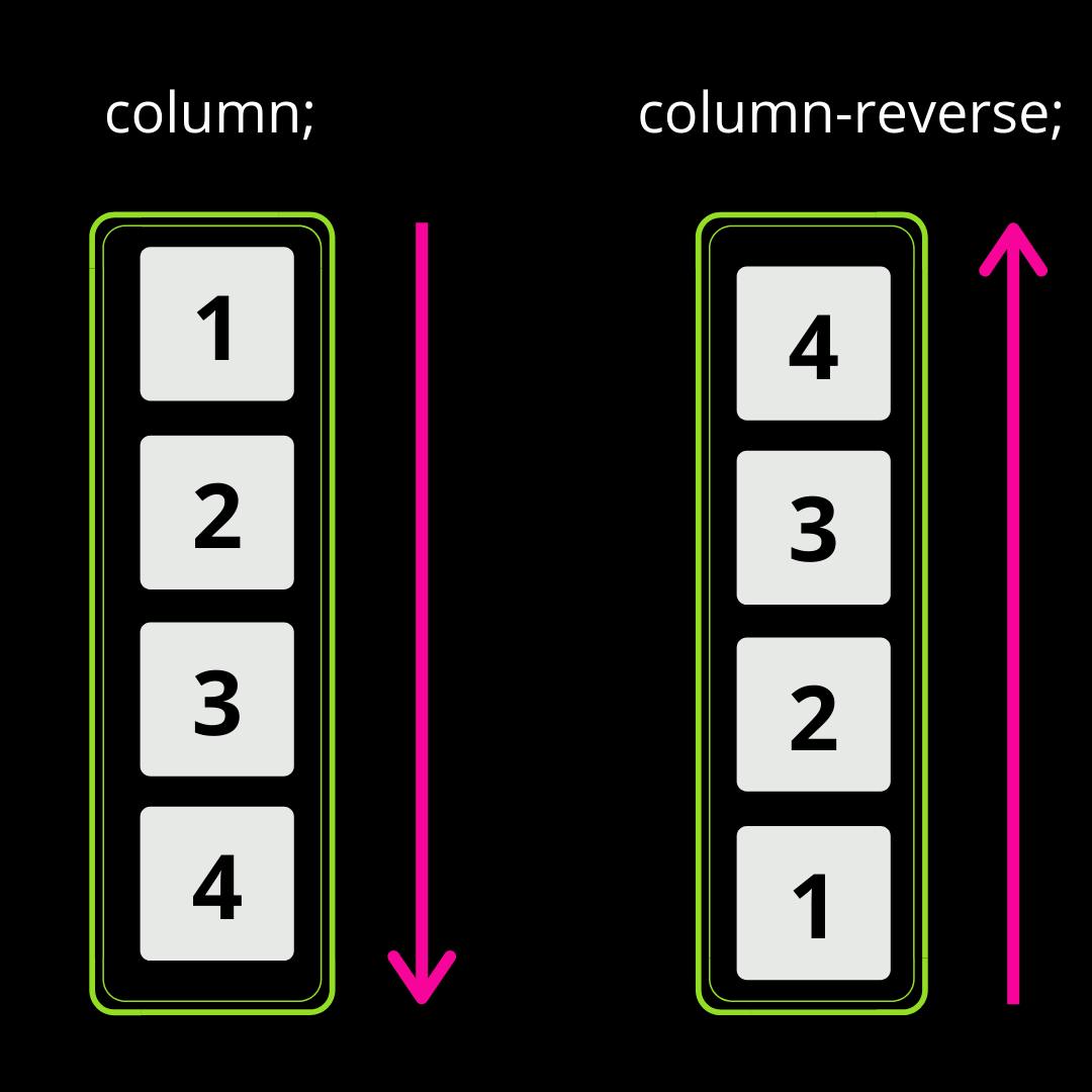
Flex Direction :
.container {
flex-direction: row | row-reverse | column | column-reverse;
}
Basically the flex-direction property aligns the flex-children in either Rows or Columns.
The property flex-direction can have 4 values : row, row-resverse, column & column-reverse.
The images below will help you understand each of the above values visually.
Flex Wrap :
.container {
flex-wrap: nowrap | wrap | wrap-reverse;
}
So, by default, the flex items will all try to fit onto one line.
We can alter this behaviour with the flex-wrap property.
nowrap(default) : All flex items will be on one line, no matter what.wrap: Flex items will wrap onto multiple lines, from top to bottom, if needed.wrap-reverse: Flex items will wrap onto multiple lines from bottom to top if needed.
flex-wrapwould align the flex-children on multiple lines provided flex-children havewidthdefined, making it super easy to achieve responsiveness to quite some extent.
I personally feel that flex-wrap is one of the best things Flexbox offers.
Flex Flow :
.container {
flex-flow: row nowrap;
}
This is a shorthand for the flex-direction and flex-wrap properties.
The default value is row nowrap.
Using the property more often is recommended as it avoids writing more lines of code, keep your code short and clean.
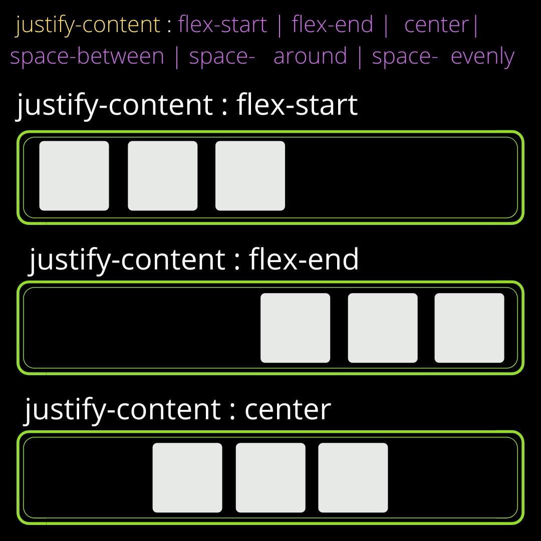
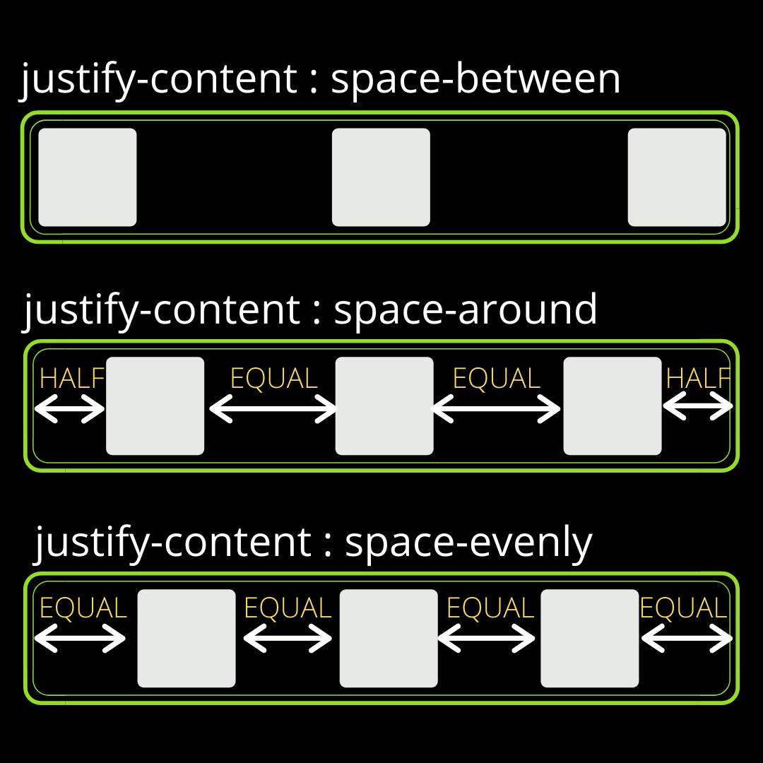
Justify Content :
.container {
justify-content: flex-start | flex-end | center | space-between | space-around | space-evenly
}
justify-content is used for Horizontal Alignment of Flex-Items.
It helps distribute the extra free space over all the flex items.
This one of the most used Flexbox properties.
flex-start(default): Items are aligned towards the start of the flex-direction.flex-end: Items are aligned toward the end of the flex-direction.center: Items are centred on a horizontal axis.space-between: Items are distributed such that the first and the last items are at extreme end other items in the middle are placed at equal distance from each other.space-around: Items are evenly distributed in the line with equal space around them except the extreme items.space-evenly: The items and the empty space is evenly distributed such that the space between any two items is equal.
These images would illustrate the above values more clearly.
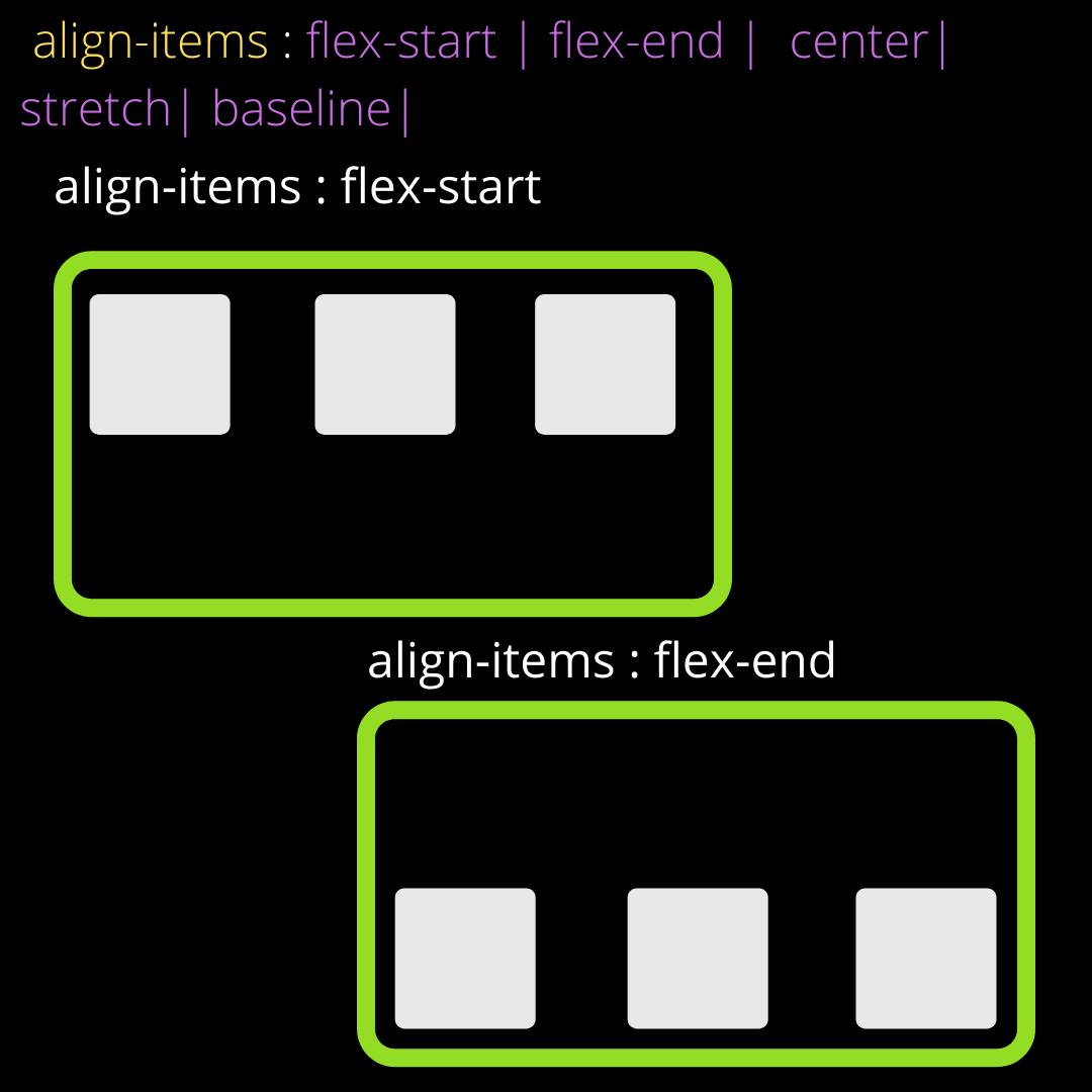
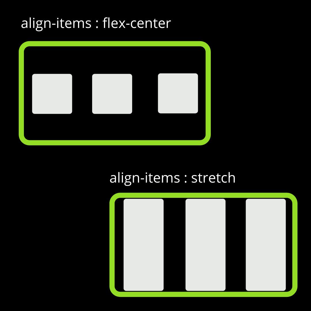
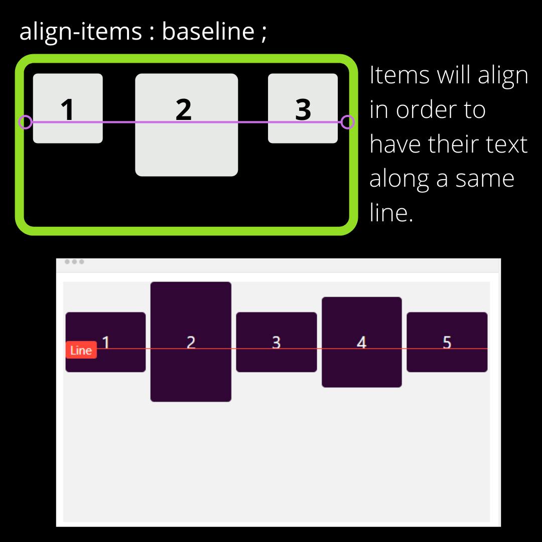
Align Items:
.container {
align-items: stretch | flex-start | flex-end | center | baseline
}
This property helps us align flex-items vertically. It is just like justify-content, but does things along the vertical axis (cross-axis).
stretch(default): Items stretch to fill the container.flex-start: Items are placed at the top of the parent container.flex-end: Items are placed at the bottom of the parent container.center: Items are centered vertically.baseline: items are aligned such as their text baselines align.
Here are images that explain better.
PS :
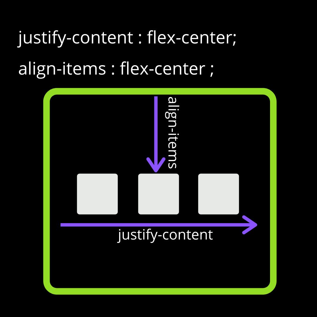
justify-content and align-items are some of the the most used flex properties and you can use them to center a div! 😂.
Jokes aside, initially these two properties confuse a lot and we end up spending plenty of time choosing the right property for a specific job.
Rule of thumb here is:
justify-content: Horizontal Alignment.align-items: Vertical Alignment.
Here's an image for visual understanding.
That's it from my side today. Let me know in the comment section if you liked the article. Also, tell me if you would like to read more about flexbox in Part-2 of this article.
Hope you enjoyed it, and if you did consider supporting me 👇