

In this article, we are going to talk about CSS POSITIONS. Knowing CSS Positions helps you design beautiful interfaces with ease. CSS allows different methods for positioning elements. We'll explore all the various position types and learn about their implementation.
The position property allows us to define the position of an element.
The Syntax :
position: desiredPosition;
We have 5 Positions :
- Static
- Relative
- Absolute
- Fixed
- Sticky
Using one of the five values above, an element can be positioned. We can then use the top, bottom, left and right properties to further define the element’s off-shift position on the page. We’ll discuss how this works in this article.
let's get started!
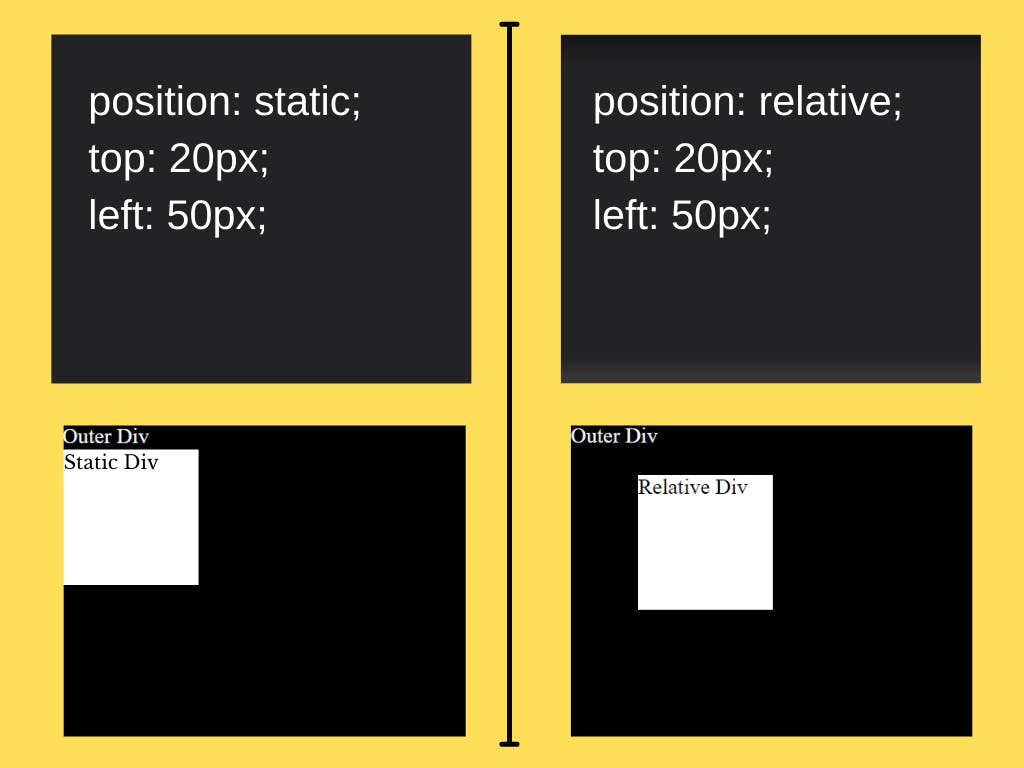
Static
This is the default position of every HTML element.
In fact, there’s not much that you can do with this position. The HTML element won't alter its position, no matter what values you associate with properties like
topbottomrightleftAlso, the
z-indexproperty won't affect.
Relative
At this position, the HTML element would shift relative to its original/initial position. To determine the amount of offset, set values for the top, right, bottom, and left properties. The other elements aren’t affected, but there will be extra space where the element would have been.
Code :
.relativeDiv {
width: 100px;
height: 100px;
position: relative;
top: 20px;
left: 50px;
}
Output:
We can see the Relative Div is 20px away from its top and 30px from its left.
Absolute
At
position: absolute, the element ignores the normal document flow & is positioned with respect to its nearest positioned ancestor.Basically, the element is position relative to its nearest positioned ancestor.
And if none of its ancestors is positioned, then the element is positioned according to the viewport a.k.a browser window and moves with scrolling.
Note: A positioned element is that which has property value relative, fixed, absolute, or sticky.
Fixed
At
position: fixedthe element is positioned relative to the viewport. And as the name suggests, the HTML is fixed at the defined position, even if the page is scrolled. There's no space left where it would have been located in the page layout initially/originally.Code:
.fixedDiv {
width: 100px;
height: 100px;
position: fixed;
top: 20px;
right: 50px;
}
Output:
CSS Positions | Blog | Hansnode | Demo Gif

We can clearly see that the Fixed Div is Fixed at its defined position even after scrolling.
Sticky
The
position: stickyis a combination of position relative and position fixed. The element's position is determined by the user's scroll. The element will behave like a relative positioned element until the viewport meets a specified position. And then the element would get "fixed" in that spot.The offset does not affect the position of any other elements.
Code:
.stickyDiv {
position: sticky;
top: 10px;
}
Output:
We can see that the Sticky Div behaves like a relatively positioned element until the viewport meets
top: 10px& then the Sticky Div gets fixed in that spot.

That's it for this article. Hope you enjoyed it, if you did you can support me here 👇
Would love to hear your thoughts.